Inbox Best Practices
Below, we've outlined the key considerations to think about when designing an app to be used by teammates in Inbox. It's important that you design your app with consideration of the other elements and context that it will appear within: your app is just one part of the Inbox interface and will sit alongside other features like the message list and conversation view.

Design the first canvas
When a teammate loads a conversation, we send an initialize request to your server and your app responds with what we call the "first canvas". The first canvas is what is shown to a teammate when they first load a conversation.
The first canvas is important because it sets expectations for teammates and is the very beginning of their experience using your app. Before they click or interact with your app, this canvas is the very first thing they'll see.
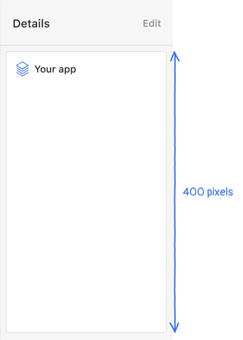
Keep the first canvas less than 400 pixels tall
- Rule: The total height of your app's first canvas must not exceed 400 pixels.
- Why? Your app appears next to other apps in a teammate's conversation details. It's important that your app not negatively impact the visibility and effectiveness of other Inbox apps.
After a teammate interacts with your app's first canvas (with a button or list click, for example), the height of your app is up to your own discretion. We strongly urge you to avoid overloading your app with too much information at any one time.
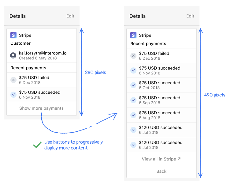
In the above example for Stripe, only the two most recent payments are shown when a teammate first loads a conversation. That's because the two most recent payments are likely to be the most relevant for teammates. A teammate can click "Show more payments" to load a new canvas that displays more payments.
Think about what the most important and relevant information is for your app to display for the first canvas, and put all other information on other canvases.
- Rule: Avoid putting all of your app's content and information in the first canvas. Use interactive components like
buttonorlistto progressively reveal more information to teammates as they interact with your app. - Why? It's important to avoid overwhelming teammates with information, especially information they don't need to use right away. This may end up pushing more helpful information in other apps off the screen.
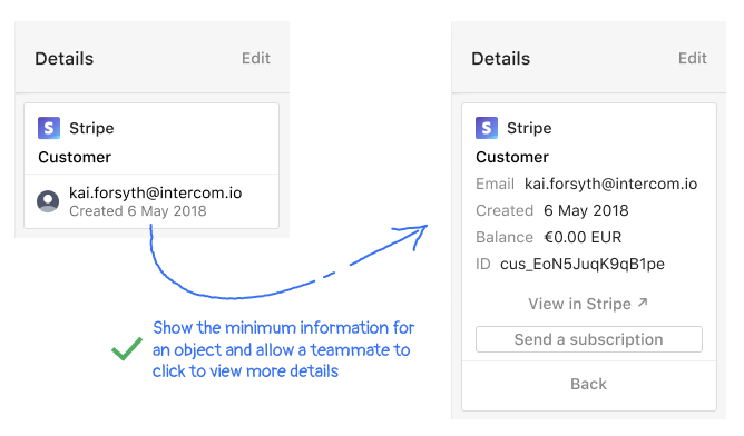
We suggest showing the minimum amount of information that a teammate absolutely needs to know in the first canvas. When teammates need more information, they can opt-in to seeing it if you use interactive components like button or list in your first canvas.
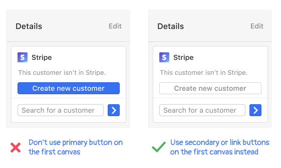
Don't use the primary button style in the first canvas
- Rule: Do not use primary styled buttons on your app's first canvas. Use secondary or link buttons on the first canvas instead.
- Why? When your first canvas loads, teammates aren't immediately focusing on and using your app. The only primary call to action in the entire Inbox interface is the reply to conversation button. All other call to action buttons are secondary to this in order to avoid a teammate's screen being filled with primary buttons, all competing for warning.
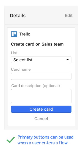
Once a teammate starts interacting with your app, then you can use primary styled buttons in secondary canvases.
For example, once a user starts using the Trello app to create a new card, only then do they use a primary styled button. This is a better experience because the "Create card" button is the primary button within the flow that a user is actively using and focusing on.
Apply consistent navigation
Navigating back and forth between canvases is a common pattern in apps for teammates. We encourage your app to apply these guidelines so that teammates have consistent experiences when they interact with apps.
Separate navigation from app content
- Rules: Use divider and spacer components to visually separate the navigation components of your app from the other content your app is displaying. Position navigation actions to the bottom of the canvas with the link style.
- Why? This helps your navigation stand out from the content of your app, which makes it clearer and easier for teammates to use.
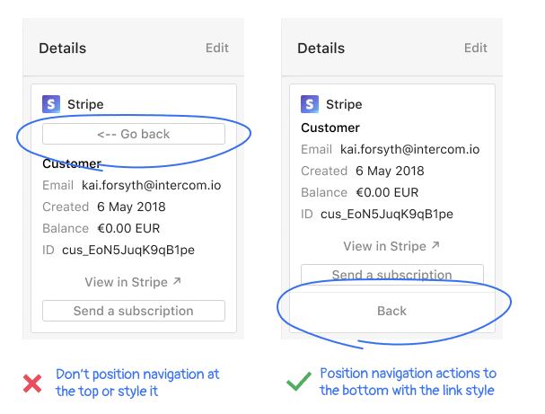
We recommend that you position your navigation actions to the bottom of cards. You can use this JSON to style your navigation:
Style app navigation actions consistently
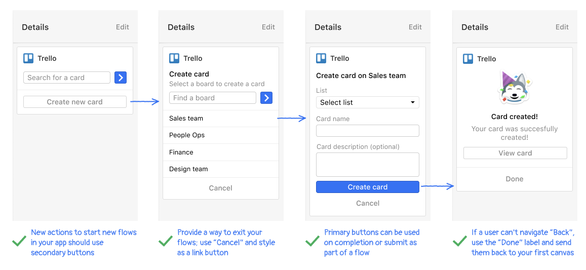
- Rules: Actions to start new flows or perform actions should be styled as
secondarybuttons. If your app has a button to go back, we suggest you label it as "Back" and style it as alinkbutton. On completion of a flow within your app, if no other actions can be taken, use alinkbutton with the label "Done" to return a teammate to your app's first canvas. - Why? This creates a predictable and intuitive means for teammates to navigate your app and complete actions. When your users spend less time figuring out how to move around your app, they'll spend more time being engaged and taking productive action.
Use primary and secondary button styles consistently
Here's a quick reference guide showing all of our rules for styling buttons and links consistently throughout your app. Follow these rules to speed up the app review process and avoid having your app getting rejected from our App Store.
| Style | Rules |
|---|---|
primary | - Don't use this style on your app's first canvas - Do use this style when a user interacts with your app to enter a flow where they might need to take a specific action, such as submitting information - Don't use this style for navigating between canvases within your app |
secondary | - Do use this style on the first canvas - Do use this style when a user starts a new flow - Do use this style as users take actions within your app - Don't use this style for navigation within your app |
link | - Do use this style for navigation that moves teammates between canvases in your app. For example: "Back", "Cancel", or "Done" actions. - Do use this style for any external links that open in a new window |
Show next steps and navigation in confirmation and success states
There may be scenarios in your app where you provide confirmation or other feedback to a teammate that an action they took was successful.
- Rule: Use a visual indicator (such as a check mark: ✅) to show that an action was successful. Keep all text concise and clear.
- Rule: Don't leave a teammate in a "dead end" where they can't proceed to another canvas in your app. Provide a link that gives teammates a way to return to a useful place in your app.
- Why? This gives teammates confidence that the actions they took were successful. They shouldn't have to guess about whether or not they've completed any tasks in your app. Likewise, they should have a clear means for taking additional actions in your app, which is why it's important to provide a navigation link back to the first canvas or another useful state.
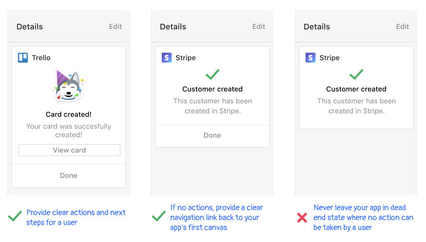
As you can see above, the Trello and Stripe apps provide teammates with clear confirmation messages that act as small, lightweight moments of celebration. They also give teammates a way to take next steps or return to canvases they saw earlier in the flow.
Make empty states and error states clear and useful
An "empty state" is often shown in your app before a teammate has taken actions or entered information into your app. They may show up during a teammate's first use of your app or in other scenarios.
Likewise, a similar "error state" may occur when something goes wrong and the user encounters a problem.
- Rule: Don't center text or use any images in empty states or error states.
- Rule: If your app can provide any useful actions or functionality, you should display this instead of an empty state or error state.
- Rule: If your app needs to display an empty state or an error state, use a muted styled paragraph text block that is left-aligned. This treatment matches the style of other empty states in the conversation details sidebar.
- Rule: Don't leave a teammate in a "dead end" where they can't proceed to another canvas in your app. Provide a link that gives teammates a way to return to a useful place in your app.
- Why? These treatments provide the greatest amounts of clarity, readability, and usability in your app while also showing the least amount of distraction or disruption. They give teammates the confirmation they need and an understanding of what they should do next.
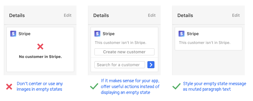
In the above example, you can see how the Stripe app provides teammates with clear information and actions to take without disrupting their experience.
Formatting date and time
Date and time are central to the messaging experience in Inbox and throughout Intercom. They help teammates prioritize their work and understand the context of conversations as they occur.
Rule: Do not use relative dates (such as "1 minute ago", "3 hours ago", "last week" and similar messages).
Why? Framework apps are unable to be updated dynamically, so we instead suggest you absolutely format date and time to prevent relative time from becoming outdated.
Rule: Format absolute dates and times to match how they're formatted elsewhere in Intercom:
- Date should be formatted as Jan 8, 2019 (an abbreviated month, a numeric day with no leading zeros, a comma, and a 4-digit year).
- Time should be formatted as 1:05PM (use a 12-hour format with no leading zero, a colon, show minutes that include a leading zero, and AM/PM in upper case)
- Date and time together should be formatted as Jan 8, 2019 at 1:05PM (follow the individual standards for date and time, use 'at' in between them)
Why? This reduces the amount of distraction and disruption for teammates because they won't have to interpret dates and times in different ways across their Intercom experience.
Rule: If your app is internationalised, make sure that your abbreviated month is appropriately translated. Also ensure that you display date and time in your user's local time zone.
Why? This provides the greatest clarity for teammates and helps them work more effectively.