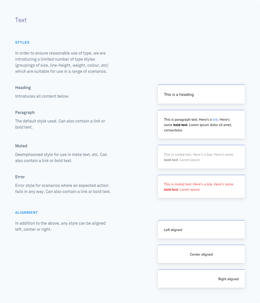
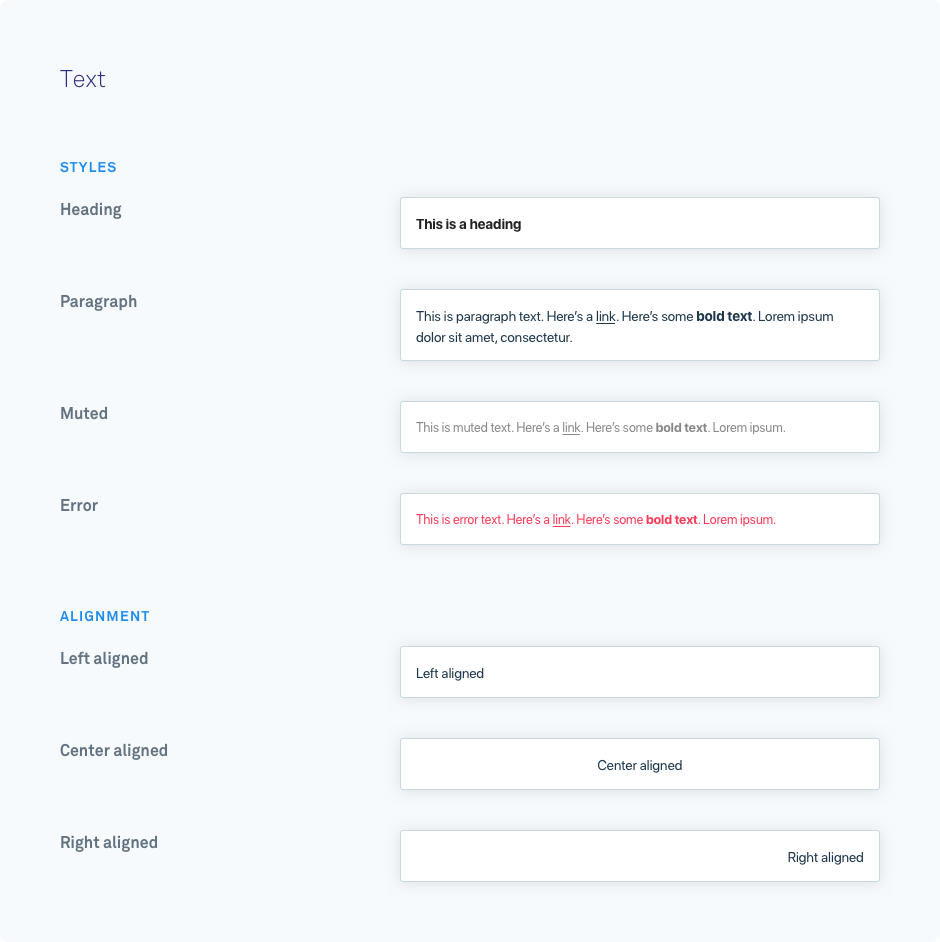
The text component is used for rendering blocks of text inside messenger cards. It does not accept most styling information (e.g. font size and text color). Links and bold font can be rendered through Markdown however.
{ type: "text", text: "Welcome to the messenger app framework", style: "header", align: "left"}| Parameter | Possible Values | Required | Function |
|---|---|---|---|
| id | Any string | No | Unique identifier for the component within this card. |
| text | Any stringMarkdown (ie. [](), **) | Yes | The text that will be rendered inside the component. |
| align | left (default)centerright | No | Aligns the text inside the component. |
| style | headerparagraph (default)mutederror | No | Styles the text in a specific preset style. |
| bottom_margin | None | No | Disables a component’s default margin-bottom of 10px. |
🚧 Line Breaks
Line breaks are not converted into tags in the rendered HTML, so all text will appear on a single line.

