Your app can be added by teammates in a number of places, in order to be used by their users, leads and visitors. In the App Framework settings of your app in the Developer Hub, you can choose for your app to be available in places like the Messenger Home, or sent within conversations via the Inbox, Messages and Workflows.
For apps placed in the Messenger Home, the first canvas is the most vital screen. Apps need to be conscious of what they're likely to be placed alongside, and you'll need to consider how to present initial actions and context when end users first view the card.
- Keep the height of your first canvas to no more than half the Messenger, so it doesn't take over too much of the end user's screen.
- Your app will appear alongside other apps in your users Messenger, so it's important that your app is considerate of its height and impact on the effectiveness of other apps.
- After a teammate interacts with your app's first canvas (with a button or list click, for example), the height of your app is up to your own discretion, but we caution overloading your app with too much.
- We suggest showing the minimum amount of information in the first canvas for a teammate to know the purpose of your app and how they need to interact with it.
Once the flow of your app is finished, you should refer users back to the start of the app for potential re-use in the future. You can do this in one of two ways:
- Use a live canvas so that upon the next visit, the app's canvas updates to the start of the flow, or with freshly relevant information. For example, in the Article Search app, users can come back and search for another article as many times as they like.
- Use a confirmation or success state screen to show that the flow is complete and the actions were successful.
- Consider using a visual indicator, like a checkmark, that an action was successful.
- Don't leave a teammate in a dead-end. Provide a call to action for a teammate to return to a useful place in your app. For example, you can use a link style button with "Done" as the text.
For apps that are to be used in conversations, every canvas needs to be conscious of where it will be inserted in the conversation and how incoming messages can disrupt the flows.
- Keep the height of every canvas in the flow to no more than half the Messenger, so it doesn't take over too much of the end user's screen and displace messages.
- Your app will appear in between messages which will be related to the context of your app. Consider this when deciding upon the content within the first canvas. For example, do you need to reiterate the next step, or can you skip to the action directly?
- Don't cram everything into one canvas. For apps used in conversations, it's better to break these down into multiple canvases within the flow to keep things concise.
Once the flow of your app is finished, you should use a confirmation or success state screen to show that the flow is complete and the actions were successful.
- Consider using a visual indicator, like a checkmark, that an action was successful.
- Provide all context regarding what actions took place in the app and any additional, valuable information. This will also be visible to your user in the conversation thread.
Sheets give you the ability to perform much more complicated workflows within the Messenger. In effect, a sheet is a full-bleed iframe takeover of the Messenger which gives developers the ability to inject a completely custom UI. Here's guidelines on when and how they should be used:
- When content can be created with framework components instead, use these instead of falling back to sheets.
- A sheet should only ever act as an extension of your app. Don't load your full website in a sheet. If a user needs to view a separate website as part of a longer workflow, link them to the site in a separate tab instead.
- No content in a sheet should mimic the Messenger design, any existing component, or Intercom product's themselves. This goes against our Intercom Platform Guidelines.
- If a list item leads to content that would be too long to fit on a new canvas, display this in a sheet instead. For example, when clicking on an articles within our Article Search app, we open a sheet as the content would be too lengthy.
- If a user closes a sheet mid-flow the current content within the sheet will be lost. So, don't use a sheet if a user needs content to remain visible or updatable at that point.
- Keep your app's style consistent. For example either go with neutral branding (like the Article Search app) or full-bleed and branded, like the Aircall Now app.
Many developers choose to provide some sort of search functionality in combination with lists within their apps. We encourage you to use these guidelines to ensure that teammates have consistent experiences when performing searches and interacting with lists across all apps.
Use the input button component with a meaningful label and placeholder text like "Search for a widget…"
On submit of a search query, display the query as the value in the input button component.
Use the list component to display search results directly underneath the search input button component.
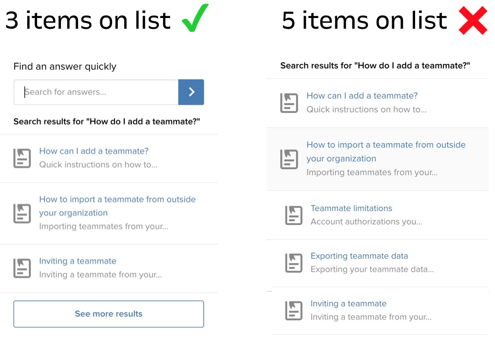
Avoid showing more than 3-5 search results. Instead, use a button component to "See more results" or use a single select component with "Next" and "Previous" options to paginate through more results.
Clicking items in a list should open a sheet instead of a card if the target content is longer than 400px.
- Where multiple fields exist, show them all and add a submit style button, instead of using multiple cards to reveal one field at a time.
- Where you have only one field, consider using the inline submit button.
In the majority of cases, you should be writing the text that your customers will be using, rather than allowing them to customize descriptions and actionable language. There's a good few reasons for this:
- The system leaves room to be abused, and could inadvertently cause damage to your brand.
- Our tone, grammar, and voice guidelines should be followed to the best of your ability.
- Your apps have a purpose and the design should reflect this, including the text copy.
However, there are good use cases to allow for this likewise, such as your app having multiple use cases. For example, surveys can often have different use cases when sent, so your users may want to change the explanatory text as to what they're about to be answering.
- Continue being opinionated on the text and set placeholders for default options.
- Provide clear titles and instructions for what the purpose of the field is and how to write best for it.
Apps should be considerate of other cultures and locales, ensuring that they're open, flexible and accessible across the world. The canvas you return should reflect this.
- Use the locale attribute provided in the context object to understand which default language the end user is using. Use this to understand which languages you should translate to.
- Use the location object provided in the user object to understand where the end user is based. Use this to ensure no images/information/actions would be offensive or inaccessible to certain countries and cultures.
- Keep app length in mind for the first canvas, as other languages or differing content could expand this past allowed dimensions.