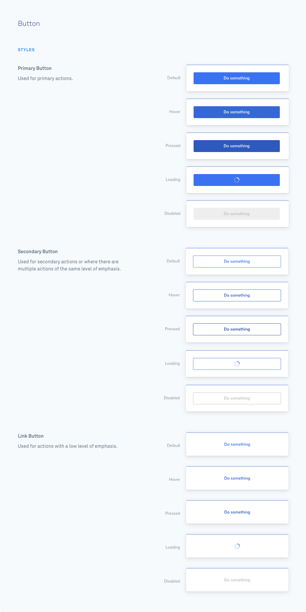
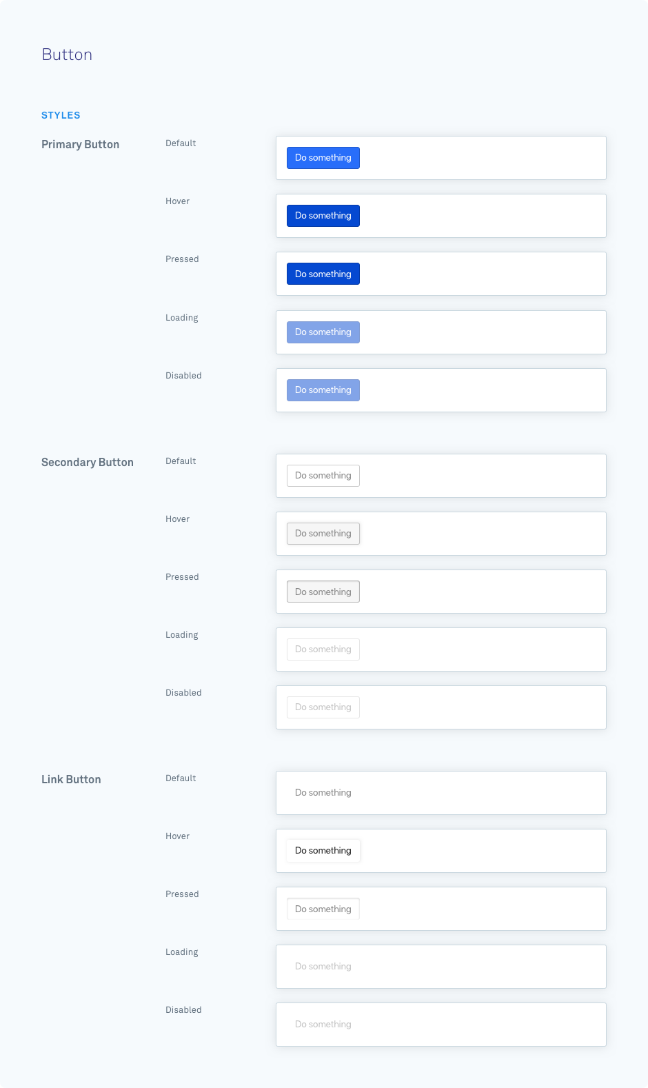
A button component is used to trigger an action. Depending on the action type, a button can:
- Submit an action
- Open a link in a new page
- Open a sheet
Buttons are submittable, meaning that when they are clicked, they will dispatch a webhook to the url specified through the relevant action. Read more about this by clicking on the different actions that can be taken above.
{ type: "button", id: "button-123", label: "Submit form", style: "secondary", disabled: true, action: { type: "url", url: "https://www.intercom.com/" }}| Parameter | Possible Values | Required | Function |
|---|---|---|---|
| id | Any string | Yes | Unique identifier for the component within this card. |
| label | Any string | Yes | The text that will be rendered inside the button. |
| action | Object | Yes | This can be a Submit Action, URL Action, or Sheets Action. |
| style | primary (default)secondarylink | No | Styles the button in a specific preset style. |
| disabled | false (default)true | No | Styles as complete and prevents further editing or interaction. |
🚧 Line Breaks
Line breaks are not converted into tags in the rendered HTML, so all text will appear on a single line.

