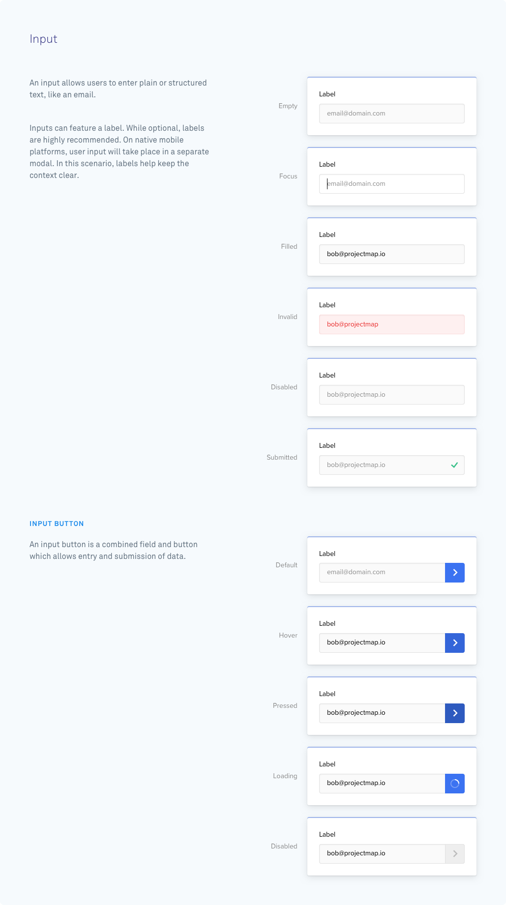
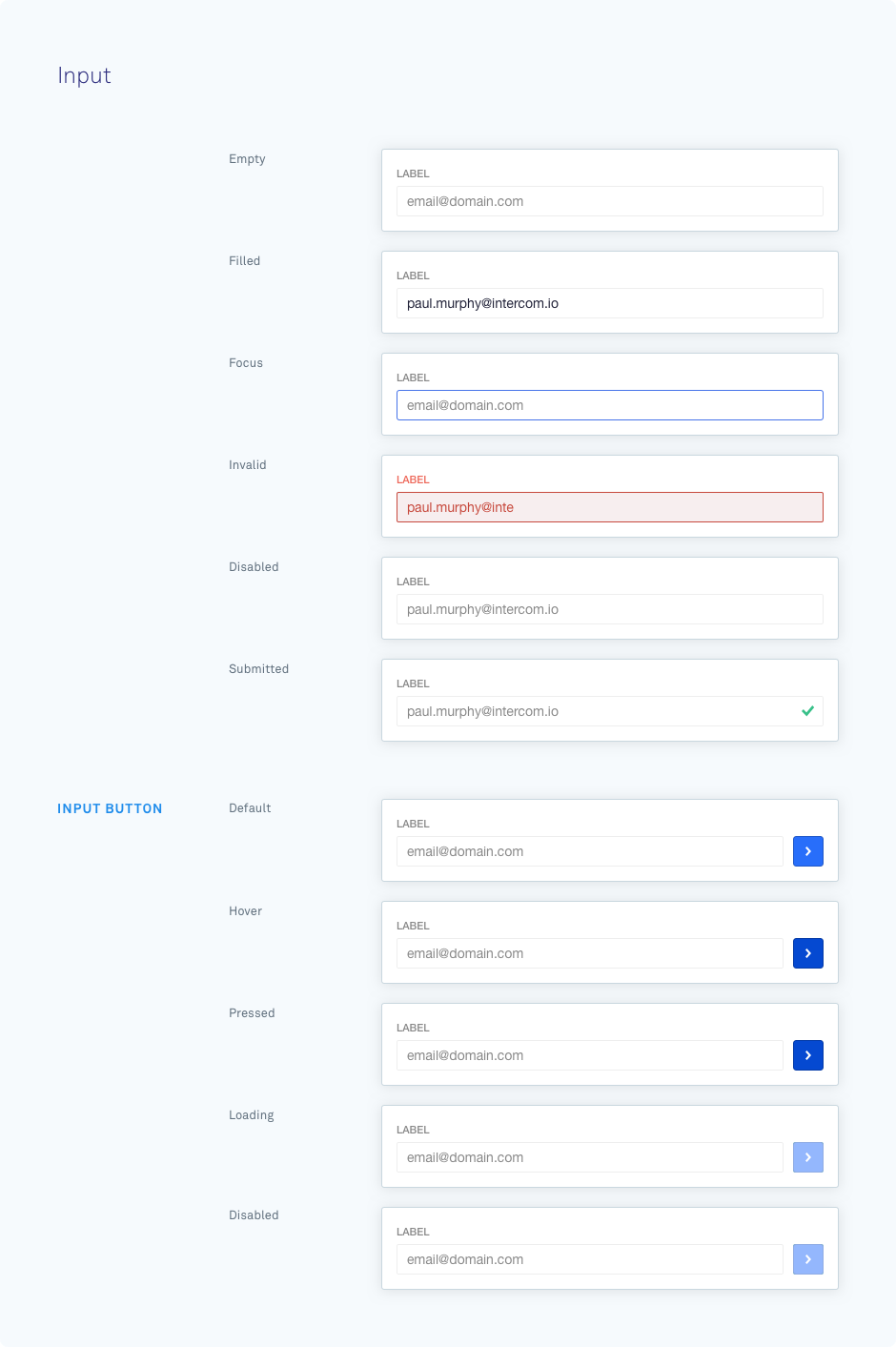
An input component is used to capture text input from the end user.
If you pass an action to the input component, it will render with an inline button which submits the value inside the input to the specified URL.
{ type: "input", id: "user_email_address", label: "Enter your email address", placeholder: "user@domain.com", value: "peter@intercom.io", save_state: "unsaved", disabled: true, action: { type: "submit" }}| Parameter | Possible Values | Required | Function |
|---|---|---|---|
| id | Any string | Yes | Unique identifier for the component within this card. |
| label | Any string | No | The text shown above the input. |
| placeholder | Any string | No | An example value shown inside the input when it’s empty. |
| value | Any string | No | The default value of the input. |
| action | Action object | No | This can be a Submit Action, URL Action, or Sheets Action. |
| save_state | unsaved (default)savedfailed | No | The defined state of the inputted value to render a specific style. |
| disabled | false (default)true | No | Styles as complete and prevents further editing or interaction. |
📘 Saved States
A
save_stateofsavedrenders the input in a style which indicates a successfully submitted value, and prevents further editing or interaction with the input. It's the onlysave_statethat changes the function and blocks any further interaction.This is the same functionality as if you set thedisabledboolean totrue. If you set thesave_stateassavedbut thedisabledboolean asfalse, we'll overwrite the boolean and still show the component in this disabled state.

