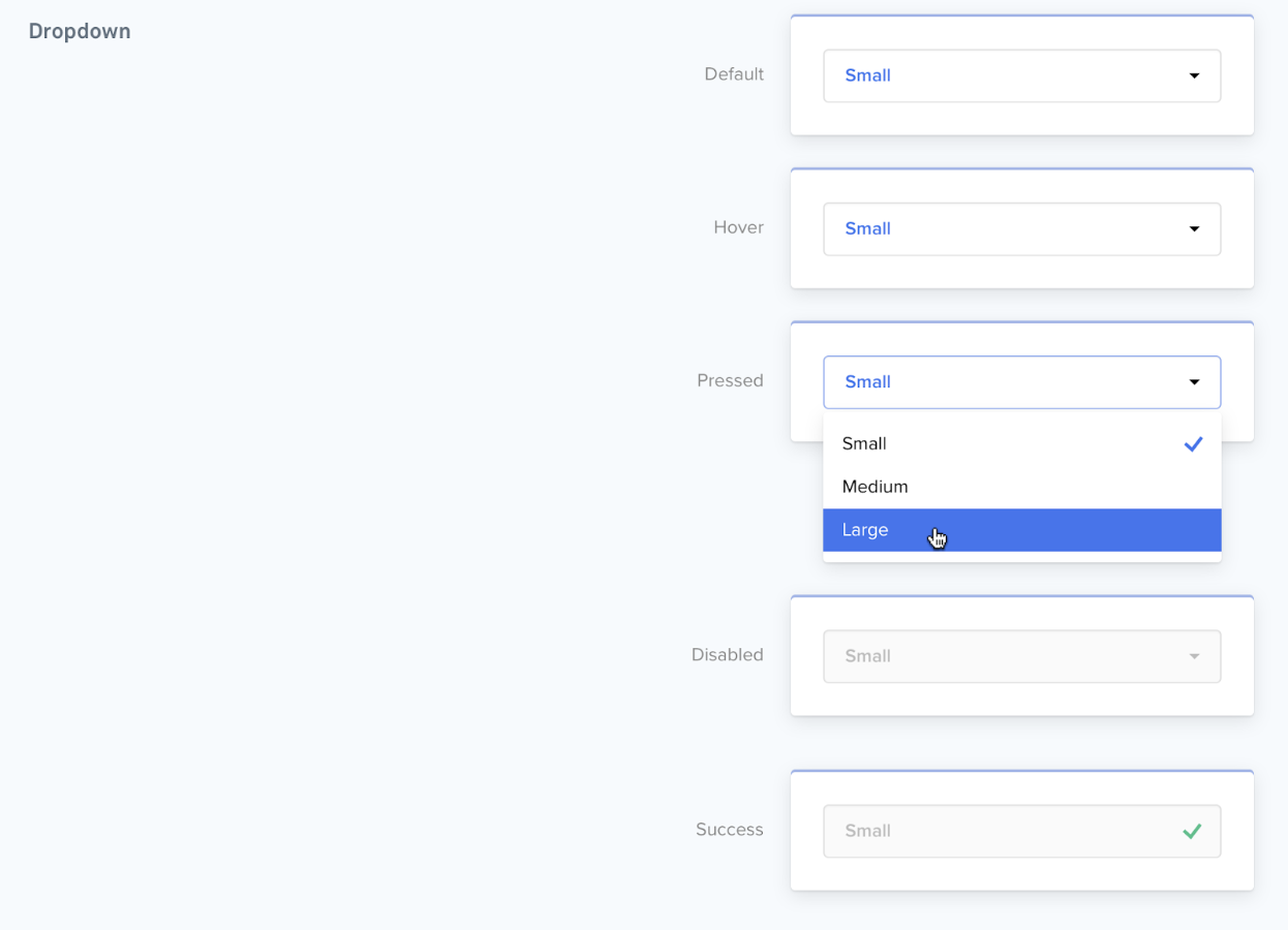
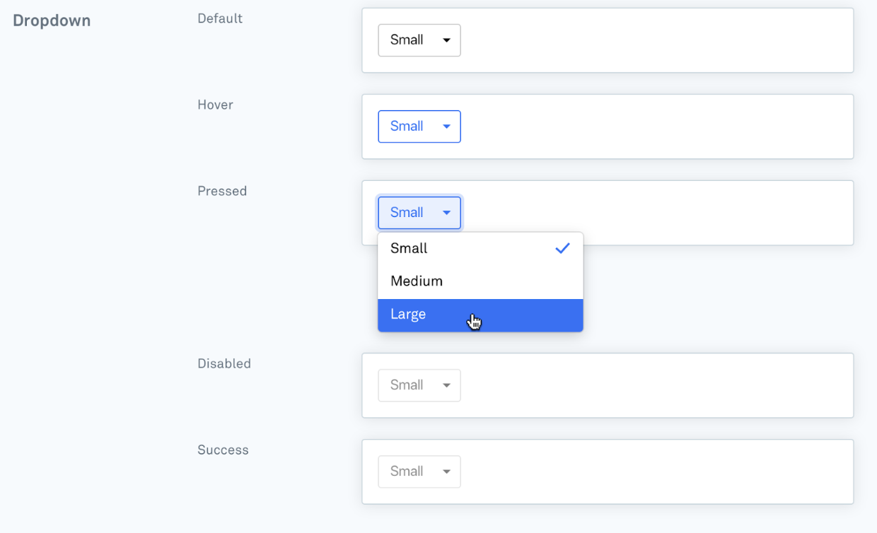
A dropdown component is used to capture a choice from the teammate or end user. It requires a collection of dropdown options, which represent the possible choices.
{
  "type": "dropdown",
  "id": "industry",
  "label": "Choose your industry",
  "options": [
    {
      "type": "option",
      "id": "banking",
      "text": "Banking"
    }, {
      "type": "option",
      "id": "tech",
      "text": "Technology"
    }
  ],
  "value": "banking",
  "save_state": "unsaved",
  "disabled": "true"
}| Parameter | Possible Values | Required | Function |
|---|---|---|---|
| id | Any string | Yes | Unique identifier for the component within this card. Dropdown components are submitted in a hash, with this id used as the key and the id of the chosen option as the value. |
| label | Any string | No | The text shown above the input. |
| options | Array | Yes | The list of options. A minimum of 2 options is required, and no more than 11 are allowed. More on the Options array is below. |
| value | Any string | No | The default value of the option. |
| save_state | unsaved (default) saved failed | No | The defined state of the inputted value to render a specific style. |
| disabled | false (default) true | No | Styles as complete and prevents further editing or interaction. |
📘 Saved States
A
save_stateofsavedrenders the input in a style which indicates a successfully submitted value, and prevents further editing or interaction with the input. It's the onlysave_statethat changes the function and blocks any further interaction.
| Parameter | Possible Values | Required | Function |
|---|---|---|---|
| id | Any string | Yes | Unique identifier for the option. Dropdown components are submitted in a hash, with this id used as the key and the id of the chosen option as the value. |
| text | Any string | Yes | The text shown within this option. |
| disabled | false (default) true | No | Styles as complete and prevents further editing or interaction. |

